
Webinars
AI-powered impact analysis for safer, faster SAP updates: Introducing Tricentis LiveCompare
Watch this webinar to achieve 100% test coverage of the most-at-risk...
Learn how to build, customize, and test SwiftUI toggles—then scale UI validation across devices faster with Tricentis Testim Mobile.

SwiftUI has made it significantly easier for developers to build modern, reactive user interfaces on Apple platforms. Simple UI components—such as toggles—play an important role in user experience, allowing users to enable or disable features with minimal effort.
However, building UI elements is only part of the job. As applications scale, it becomes just as important to ensure that UI interactions behave correctly across devices, OS versions, and real user scenarios. This is where reliable testing workflows come into play. Platforms like Tricentis Testim Mobile complement SwiftUI development by helping teams validate UI behavior—such as toggle interactions—through scalable, AI-powered mobile testing.
In this article, we’ll explore how to create and customize toggles in SwiftUI, manage their behavior, and test them effectively.
SwiftUI is a declarative framework for building user interfaces on Apple’s platforms.
SwiftUI is a declarative framework for building user interfaces on Apple’s platforms. It was introduced at the Worldwide Developers Conference (WWDC) in 2019 as a replacement for the aging UIKit framework.
SwiftUI is built on top of the Swift programming language, providing a new way to build user interfaces that are more concise and easier to understand than UIKit.
One of the key features of SwiftUI is its use of declarative syntax. With a declarative syntax, you describe the user interface you want to create, and the framework creates and updates the user interface for you. This means that you don’t have to write as much code, and you can focus on the content and layout of your user interface rather than the mechanics of how it’s created and updated.
SwiftUI also includes many built-in views and controls, such as text fields, buttons, and lists, which you can use to build your user interface. One such control is the toggle.
Toggles are a common UI element that allows users to switch between two mutually exclusive states, such as “on” and “off.” They’re often used to enable or disable a particular feature or option in an app.
For example, you might use a toggle to enable or disable an app’s push notifications or switch between different display modes. A small oval button with a round dot inside typically represents a toggle. The user can move this dot to the left or right to change the current state.
In terms of functionality, toggles are similar to switches but are typically smaller and more compact. Developers and designers use toggles when there’s limited space available for UI elements or when they want to provide a simple and straightforward way for users to enable or disable a particular feature.
The first step to creating a toggle in SwiftUI is to declare a Bool value in your app’s state that will represent the current state of the toggle. This value is known as a binding and is used to bind the toggle to your app’s state. You can then use the Toggle view and pass in the binding as a parameter to create the toggle.
Here’s an example of how to create a toggle in SwiftUI:
struct ContentView: View {
    @State private var isOn = false

    var body: some View {
        Toggle(isOn: $isOn) {
            Text("Toggle Me")
        }
    }
}
In this example, we create a ContentView struct that conforms to the View protocol. The ContentView has a @State property called isOn, a Bool value representing the current state of the toggle. We then use the Toggle view to create the toggle and bind it to the isOn property using the isOn: parameter.
In addition to the isOn: parameter, the Toggle view also has a label parameter that you can use to specify the text that you should display next to the toggle. In this example, we use the Text view to display the label “Toggle Me.”
You can customize the appearance of the toggle by using the foregroundColor, accentColor, and label modifiers. For example, to change the foreground color of the toggle to red and the accent color to green, you can do the following:
Toggle(isOn: $isOn) {
    Text("Toggle Me")
}.foregroundColor(.blue)
.toggleStyle(SwitchToggleStyle(tint: .blue))
The foregroundColor modifier specifies the color of the toggle itself, while the toggleStyle modifier sets the color of the toggle when it is in the “on” state.
You can also change the style of the toggle completely to more of a button style where the button can be either on or off. To do this, use the toggleStyle modifier again and use the .button value.
Toggle(isOn: $isOn) {
    Text("Toggle Me")
}.toggleStyle(.button)
.tint(.red)
Pretty cool, right?
How about we add a bit more functionality to our toggle app? Let’s create a simulation of a settings view where a user can choose to follow other users of a social network app.
We’ll first need to create a separate struct that implements the identifiable protocol to create a list of toggles that the user can independently toggle. Then, we can track their states in a single collection.
struct UserList: Identifiable {
    var id: String
    var isFollowing = false
}
Now create a @State variable that will contain a list of the structs previously defined. In this case, we’re using a UserList containing an ID and a Bool indicating if you’re following the user.
@State var lists = [
UserList(id: "Pewdipie", isFollowing: false),
UserList(id: "Markiplier", isFollowing: false),
UserList(id: "AJourneyForWisdom", isFollowing: false),
UserList(id: "GameTheory", isFollowing: false),
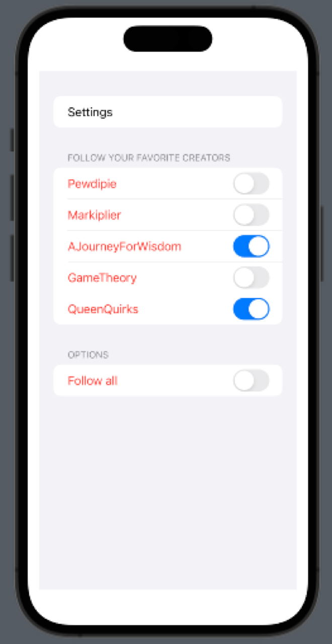
UserList(id: "QueenQuirks", isFollowing: false)]Finally, create a Form container inside the body view and add the Toggle element inside. In this case, since you’re dealing with a list, you can use a ForEach helper to represent them. Contain the toggle inside a Section container to keep the elements neatly aggregated.
You can also add a separate Toggle that would trigger all other toggles as a primary control.
var body: some View {
    Form {
        Section {
            Text("Settings")
        }
        Section("Follow your favorite creators") {
            ForEach($lists) { $list in
                Toggle(list.id, isOn: $list.isFollowing)
                    .foregroundColor(.red)
                    .toggleStyle(SwitchToggleStyle(tint: .blue))
            }
        }
        Section("Options") {
            Toggle("Follow all", sources: $lists, isOn: \.isFollowing)
                .foregroundColor(.red)
                .toggleStyle(SwitchToggleStyle(tint: .blue))
        }
    }.padding()
}
Notice that there’s no event handler taking care of the state of the toggles. If you run this code, all toggles respond accordingly. Why is this? Well, the isFollowing variable holds the state of the toggle in question. Since this is contained inside a @State variable, the state is synchronized between all views bound to it. So, when you tap on a toggle, the state of these variables changes.
Custom event management on SwiftUI toggles
But what if you wanted to add some code to do something else when the user tapped the toggle? Well, you can use the onToggle modifier to specify a closure to execute when the toggle’s state changes. This closure will be called every time the toggle’s state changes. Swift will then pass a Bool value representing the new state of the toggle.
Here’s an example of how to use the onToggle parameter:
Toggle(list.id, isOn: $list.isFollowing)
.foregroundColor(.red)
.toggleStyle(SwitchToggleStyle(tint: .blue))
.onChange(of: list.isFollowing) { state in
    print("toggled to \(state)")
}
In this example, the closure will be called every time the toggle’s state is changed. Additionally, the value parameter will be set to “true” if the toggle is turned on.
You can use this closure to perform any necessary actions in your app when the toggle’s state is changed.
Before testing your work, you must do a little setup and ensure that all toggles respond accordingly.
Before testing your work, you must do a little setup and ensure that all toggles respond accordingly. First, add the accessibilityIdentifier modifier to the toggle elements and provide a unique name to them. In the case of the toggles inside the ForEach helper, you can use the current item ID.
Form {
    Section {
        Text("Settings")
    }
    Section("Follow your favorite creators") {
        ForEach($lists) { $list in
            Toggle(list.id, isOn: $list.isFollowing)
                .foregroundColor(.red)
                .toggleStyle(SwitchToggleStyle(tint: .blue))
                .onChange(of: list.isFollowing) { state in
                    print("toggled to \(state)")
                }
                .accessibilityIdentifier(list.id)
        }
    }
    Section("Options") {
        Toggle("Follow all", sources: $lists, isOn: \.isFollowing)
            .foregroundColor(.red)
            .toggleStyle(SwitchToggleStyle(tint: .blue))
            .accessibilityIdentifier("FollowAll")
    }
}.padding()
Now, go to the UITest.swift class inside your testing target directory and add the following test case.
func testTogglesRespondCorrectly() throws {
    // UI tests must launch the application that they test.
    let app = XCUIApplication()
    app.launch()
    // Get all toggles visible in the current view.
    let toggles = app.switches
    // Wait one second
    sleep(1)
    // Execute UI action
    toggles["AJourneyForWisdom"].tap()
    toggles["QueenQuirks"].tap()
    // Wait one second
    sleep(1)
    // Assert your assumptions
    XCTAssertEqual((toggles["AJourneyForWisdom"].value != nil), true, "Toggle is not responding!")
    XCTAssertEqual((toggles["QueenQuirks"].value != nil), true, "Toggle is not responding!")
    // Execute UI action
    toggles["FollowAll"].tap()
    // Wait one second
    sleep(1)
    // Assert your assumptions
    XCTAssertEqual((toggles["Pewdipie"].value != nil), true, "Toggle is not responding!")
    XCTAssertEqual((toggles["Markiplier"].value != nil), true, "Toggle is not responding!")
    XCTAssertEqual((toggles["AJourneyForWisdom"].value != nil), true, "Toggle is not responding!")
    XCTAssertEqual((toggles["GameTheory"].value != nil), true, "Toggle is not responding!")
    XCTAssertEqual((toggles["QueenQuirks"].value != nil), true, "Toggle is not responding!")
    // Assert your assumptions
    XCTAssertEqual((toggles["FollowAll"].value != nil), true, "Toggle is not responding!")
    // Wait one second
    sleep(1)
}
As you can see, you first retrieve all visible toggles in the app’s current view. Then, you perform a UI action and validate your assumptions on the app’s state. It’s pretty straightforward.
Now, you can build from this example and validate more complex behaviors in your app.
While XCTest works well, maintaining UI tests can become time-consuming as apps grow more complex. This is where Tricentis Testim Mobile adds significant value.
Tricentis Testim Mobile enables teams to:
This allows teams to focus on building features—without being slowed down by test maintenance.
Toggles are a simple yet powerful UI component in SwiftUI, ideal for enabling and disabling features with minimal user effort. SwiftUI’s declarative approach makes them easy to implement, customize, and manage.
As your app evolves, ensuring that these interactions behave correctly in real-world conditions becomes essential. By combining SwiftUI best practices with Tricentis Testim Mobile, teams can confidently ship high-quality mobile experiences—faster and with less effort.
You can find the complete project referenced in this article in the original repository.