
Forrester Consulting research: The Total Economic Impact of SAP Enterprise Application Quality Assurance Solutions by Tricentis
Forrester finds Tricentis drastically improves testing speed,...
This new blog from Tricentis provides 64 best metrics for improving tester’s productivity and quality of product.
Software testing metrics are a way to measure and monitor your test activities. More importantly, they give insights into your team’s test progress, productivity, and the quality of the system under test. When we ask ourselves “What have we tested?,” metrics will give us better answers than just “we have tested it.” Different teams measure various aspects depending on what they want to track and control or improve.
A metric usually conveys a result or a prediction based off the combination of data.
Result metrics: metrics that are mostly an absolute measure of an activity/process completed.
Example: Time taken to run a set of test cases in a suite
Predictive metrics: metrics that are derivatives and act as early warning signs of an unfavorable result.
Example: Defects created vs. Resolved chart shows the rate of defect fixing. This grabs the team’s attention if this rate is slower than the rate desired.
The aim of collecting test metrics is to use the data for improving the test process, rather than to just show fancy reports. This includes finding tangible answers to the questions:
Good answers to these questions need measurement. This post includes 64 of the absolute, derivative, result, and predictive metrics that testers and QA managers use most often.
As a tester, your road to metric creation has to start somewhere. Fundamental QA metrics are a combination of absolute numbers that can then be used to produce derivative metrics.
Absolute numbers are a great starting point, but typically they are not enough alone.
For example, if you report on the follow grid, this may not be enough to understand if we are on schedule for completion, or what results we should be looking into each day.
| Day 1 | Day 2 | Day 3 | |
| Results Completed | 35 | 40 | 45 |
In this case, the absolute numbers produce more questions than answers. With the help of derivative metrics, we can dive deeper into answering where to solve issues in our testing processes.
The following are the derived metrics that aid Test Tracking and Efficiency:
| 13. |
|
| 14. |  |
| 15. |  |
| 16. |  |
| 17. |  |
| 18. |  |
| 19. |  |
| 20. |  |
| 21. |  |
Test effort metrics will answer the questions: “how long, how many, and how much?” These metrics are great to establish baselines for future test planning. However, you need to keep in mind that these metrics are averages. Half of the values fall over the average and half of them under.
Some of the specific measures are:
| 22. |  |
| 23. |  |
| 24. |  |
| 25. |  |
| 26. |  |
| 27. |  |
Test effectiveness answers, “How good were the tests?” or “Are are we running high values test cases?” It is a measure of the bug-finding ability and quality of a test set. Test effectiveness metrics usually show a percentage value of the difference between the number of defects found by the test team, and the overall defects found for the software.
28. Metrics Based: Test effectiveness using defect containment efficiency

The higher the test effectiveness percentage, the better the test set is and the lesser the test case maintenance effort will be in the long-term.
Example: If for a release the test effectiveness is 80%, it means that 20% of the defects got away from the test team.
29. Context Based: Test effectiveness using team assessment
Using defect containment efficiency metrics might not work when:
At times like this, we will need another way to measure test set effectiveness that is opinion or context based.
You can ask your team to rate the test set for how good it is. Before you do so, it is important to tell your team to be unbiased and define what a good test set means. For example, your team may decide that a good test set should cover high risk requirements adequately. Be realistic and focused on the most critical areas of your application.
Your team could also use a subjective scaling method. Out of a 100% rating (1 to 10 scale), ask your team to give a score to the test set as to how complete, up to date, and effective the test set stands today. Get an average on the score to get the team’s perceived average test effectiveness. Talking about what tests are good and bad from the perspective of the subject matter expert, proves to be a meaningful exercise in narrowing your test focus.
It is important to tell your team to be unbiased and to define what a good test set means.
Software quality metrics gauge the health of the application that are under test. Inevitably, the next core set of metrics that you want to analysis revolves around coverage. Test coverage metrics measure the test effort and help answer, “How much of the application was tested?”
For example, “Of these tests that are passing or failing, what are are the artifacts or area of my application that they are designed to ensure my products are produced in a high quality.” Below are some key test coverage metrics.
| 30. |  |
| 31. |  |
32. Test cases by requirement
| REQ | TC Name | Test Result |
| REQ 1 | TC Name1 | Pass |
| REQ 2 | TC Name2 | Failed |
| REQ 3 | TC Name3 | Incomplete |
33. Defects per requirement (Requirement Defect Density)
| Req name | Total # of Defects |
| Req A | 25 |
| Req B | 2 |
34. Requirements without test coverage
| REQ ID | REQ NAME | REQ STATUS |
| REQ001 | REQ A | To Do |
| REQ002 | REQ B | Done |
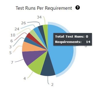
Even though a higher test coverage % and charts can instill confidence in your test effort, it is a relative value. Just like we can’t find all bugs, we cannot create enough tests to achieve 100% test coverage. This is not a limitation of the tester, rather it’s due to the reality that all systems are unbound. There are countless tests when we consider field, function, and end-to-end levels of testing. Therefore, it’s good to define exactly would would qualify as 100% test coverage to a limited test inventory.
People (time), infrastructure, and tools contribute towards the cost of testing. Testing projects do not have infinite monetary resources to spend. Therefore, it is important to know how much you intend to spend and how much you actually end up spending. Below are some of the Test Economics Metrics that can help your current and future budget planning.
35. Total allocated costs for testing
36. Actual cost of testing
For example, if your budget is 1000 dollars and that includes testing 100 requirements, the cost of testing a requirement is 1000/100= 10 dollars. Cost per test hour, 1000 dollars for 100 hours means 10 dollars for every hour. This of course assumes that all requirements are equal in complexity and testability.
These numbers are important as baselines and help with estimating for future budgets for projects.
37. Budget variance
38. Schedule variance
39. Cost per bug fix
40. Cost of not testing
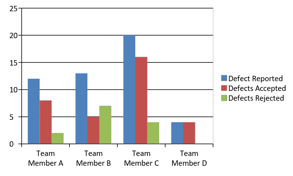
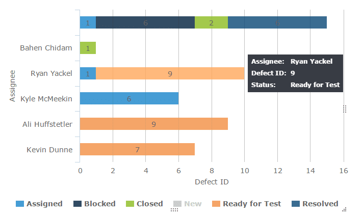
These metrics can be used to understand if work allocation is uniform for each test team member and to see if any team member needs more process/project knowledge clarifications. These metrics should never be used to attribute blame, but used as a learning tool.
41. Distribution of defects returned, per team member – Insights 2.0
42. Distribution of open defects for retest per test team member – Insights 2.0
43. Test cases allocated, per test team member – Insights 2.0
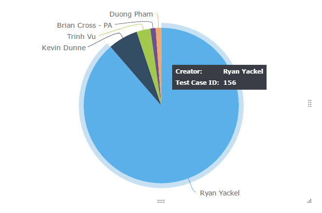
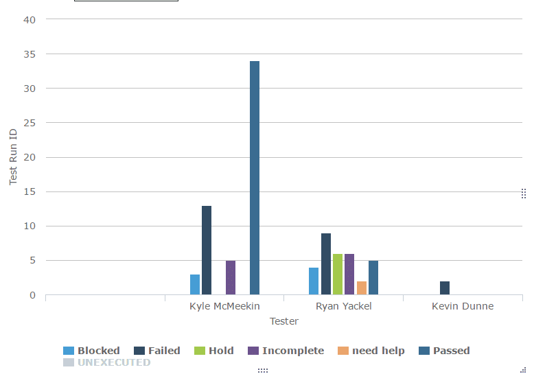
44. Test cases executed by test team member – Insights 2.0
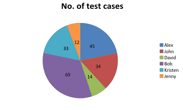
Typically, pie charts or histograms are used to get a quick snapshot of work assignment. The chart below immediately brings to our attention that Bob is overbooked and David is underutilized. This gives the test lead/manager an opportunity to look into why that is the case and take corrective measures if needed.
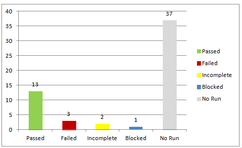
Test Execution snapshot chart shows the total executions organized as passed, failed, blocked, incomplete, and unexecuted for easy absorption of the test run status. These charts are great visual aids for the daily status meeting because raw numbers have a higher chance of slipping through people’s minds. The growing and shrinking bars capture attention and communicate progress and speed much more effectively.
45. Test execution status chart
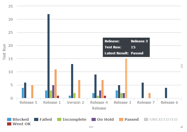
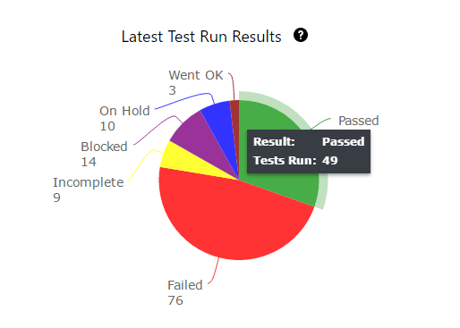
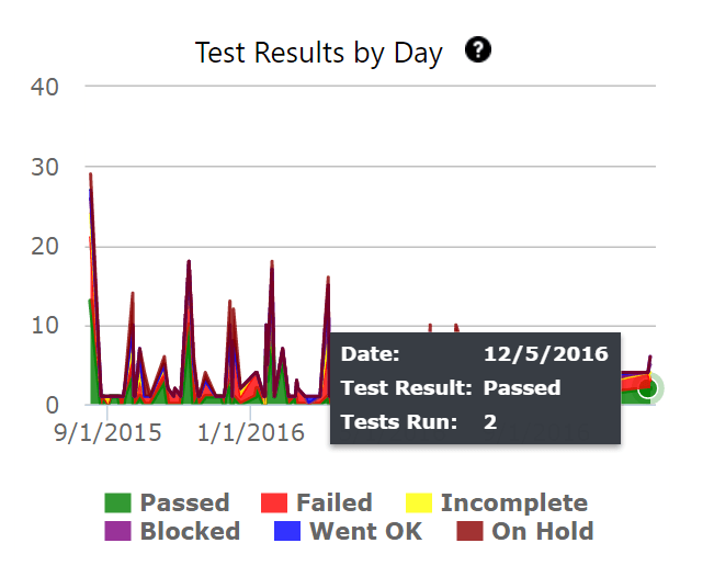
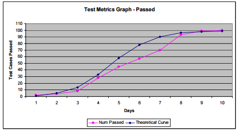
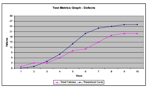
These charts help in understanding how the rate of testing and the rate of defect finding compare with desired values.
Taking the cumulative defect counts and test execution rates, the theoretical curve is plotted. This in comparison with the actual values will trigger an early red flag that test processes need to change if the targets are to be reached.
46. Test Execution Tracking and Defect Find Rate Tracking
More information and image source
Software undergoes changes – frequent, few, and far between. Changes incorporated have to be monitored to understand their impact on the stability of the existing system. Changes usually induce new defects, reduce application stability, cause timelines to slip, jeopardize quality, etc.
47. Effect of testing changes
Total number of defects that can be attributed to changes. This could mean making sure defects have proper affected and fix visions attached when they are reported to development. It is a little bit of an effort to categorize these defects as change related and not, but it is worth it.
48. Defect injection rate
Number of tested changes /problems attributable to the changes
For example: If ten changes were made on the system and 30 defects were attributable to the changes, then each change ended up injecting three defects and the defect injection rate is 3 per change.
Knowing this number will help predict the amount of defects that could be expected per new change. This allows test teams to strategically use retrospective meetings to understand their capacity to help identify and fix defects coming from new changes.
Defects can be categorized based on type, root cause, severity, priority, module/component/functional area, platform/environment, tester responsible, test type, etc. Odds are that your team right how has set up a whole list of refined classifications for defect reporting.
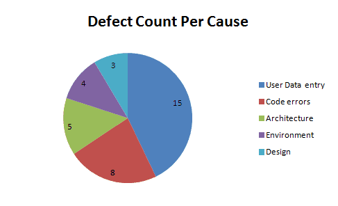
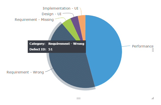
Defect distribution charts are helpful in understanding the distribution and to identify areas to target for maximum defect removal. By using a histogram, pie or Pareto charts that show where your development and testing efforts should go.
49. Defect distribution by cause
50. Defect distribution by module/Functional area
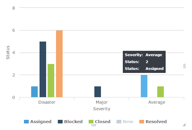
51. Defect distribution by Severity
52. Defect distribution by Priority
53. Defect distribution by type
54. Defect distribution by tester (or tester type) – Dev, QA, UAT or End user
55. Defect distribution by test type-Review, walkthrough, test execution, exploration, etc.
56. Defect distribution by Platform/Environment
A histogram or a pie chart shows an instant visual identification to highly affected areas. But, when there are too many parameters, without patterns that are difficult to discern, you might have to use a Pareto chart.
Defect Distribution pie chart: This serves one purpose ONLY. It helps you to quickly find the areas that are most dense (the reason for most defects.)
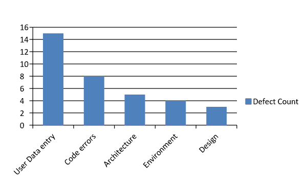
Defect distribution histogram:
When creating a histogram, be sure to organize your data values from High to low or low to high for most impact.
You can stop here, but to get more out of your metrics, continue with the next step.
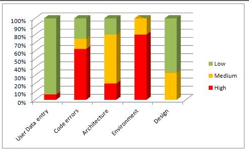
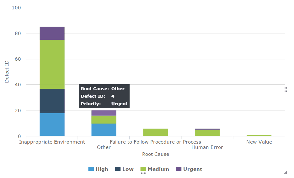
Combine the histogram with the distribution of Severity of defects in each cause. This will give you the areas that you should focus on more accurately.
For example: We know that the area that caused most defects was User Data Entry, but just because the count is high we need not necessarily focus on that first because most of the “User Data Entry” are low(in green). The next category that has the highest number of defects and with a high portion of severe issues is “Code Errors”. So this chart will refine our data and give us a much deeper understanding of where to channel further development and fixing effort.
Defect distribution Pareto chart:
You could also create a Pareto chart to find which causes will fix most defects. In many cases, a Pareto chart may not be necessary. However, if there too many causes and the histogram or pie chart is insufficient to show the trends clearly, a Pareto chart can come in handy.
To know which causes to focus on in order to fix maximum defects with minimum work (or what 20% of the causes can fix 80% of the defects), draw a line at the 80% mark on the Secondary axis and drop it on to the X axis, as shown below:
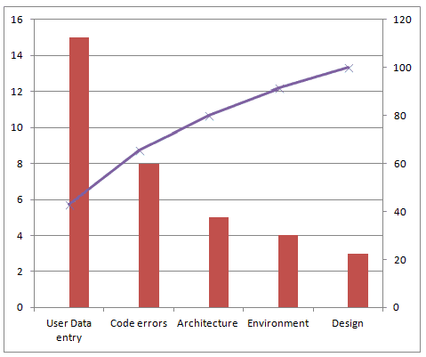
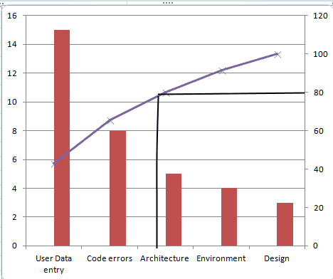
The causes User Data Entry and Code Errors should get more focus than others.
Defect distribution at the end of test cycles or at a certain point in test cycles is a snapshot of defect data at that point in time. It cannot be used to derive conclusions if things are getting better or worse. For example: At a point of time, you will know that are X number of severe bugs. We don’t know if X is more than the last cycle or less or is the same.
With the distribution over time, you will know what’s been going with the defects in each category. We can see if defects have been increasing, decreasing or are stable over time or over releases.
Defect distribution over time is a multi line graph showing the defects per cause/module/severity trends over a period of time.
57. Defect Distribution over time by Cause
58. Defect Distribution over time by Module
59. Defect Distribution over time by Severity
60. Defect Distribution over time by Platform
For the following data:
| Test Cycle | Code Error | Security Problem(access permissions) | User error(data entry) |
| Cycle 1 | 8 | 4 | 15 |
| Cycle 2 | 7 | 3 | 13 |
| Cycle 3 | 1 | 5 | 9 |
| Cycle 4 | 1 | 5 | 4 |
| Cycle 5 | 0 | 4 | 1 |
Plot a multiline chart for the 3 causes over 5 cycles, as below:
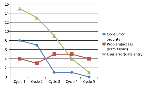
Here is what the chart can help us understand:
Limitations:
61. Defects created vs. defects resolved chart
Bug found vs. fixed chart is a defect analysis line chart that lets us see defect removal process patterns and understand defect management effectiveness
To start creating Fixed vs. Found chart, you will have to first collect the no. of defects found and no. of defects resolved everyday during a test cycle. This is one of the charts that need cumulative numbers to make sense. Consider the following defect data over a 10 day long test cycle:
| Test Cycle 1- Date | Bugs created | Bugs resolved | Cumulative bugs created(Total no. of bugs created so far) | Cumulative bugs resolved(Total number of bugs resolved so far) |
| 10/10/2016 | 6 | 4 | 6 | 4 |
| 10/11/2016 | 3 | 0 | 9 | 4 |
| 10/12/2016 | 4 | 4 | 13 | 8 |
| 10/13/2016 | 2 | 4 | 15 | 12 |
| 10/14/2016 | 2 | 3 | 17 | 15 |
| 10/15/2016 | 0 | 0 | 17 | 15 |
| 10/16/2016 | 1 | 0 | 18 | 15 |
| 10/17/2016 | 0 | 2 | 18 | 17 |
| 10/18/2016 | 0 | 2 | 18 | 19 |
| 10/19/2016 | 0 | 0 | 18 | 19 |
A defect created vs. resolved chart for the above data looks like this:
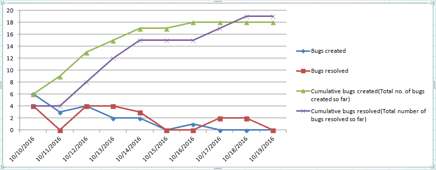
This chart is great but there are too many lines that distract us. The raw numbers of bugs created and resolved is meaningless, you can remove them from the chart for a cleaner created vs. resolved chart, as shown below:
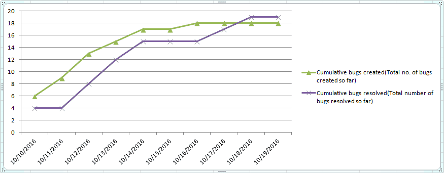
This chart answers the following questions:
Here’s how:
Limitations: While this chart answers a lot of important questions, it does have its limitations.
References:
https://confluence.atlassian.com/jira064/created-vs-resolved-issues-report-720416052.html
Managing the Testing Process, Rex Black, Chapter 4: “How Defect Removal Proceeds”
http://www.wiley.com/WileyCDA/WileyTitle/productCd-0470404159.html
62. Defect removal efficiency /defect gap analysis
Defect removal efficiency is the extent to which the development team is able to handle and remove the valid defects reported by the test team.
To calculate the defect gap, get a count of total defects submitted to the Development team and the total number of defects that were fixed by the end of the cycle. Calculate a quick percentage using the formula,

Example: In a test cycle if the QA team reported 100 defects out of which 20 were invalid (not bugs, duplicates, etc.) and if the development team has resolved 65 of them, the defect gap % is: (65/100-20)X100= 81%(approximately)
When the data is collected over a period of time, the defect gap analysis can also be plotted as a graph as below:
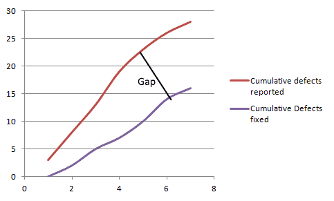
A large gap shows that the development process needs changing.
More Information: https://www.equinox.co.nz/blog/software-testing-metrics-defect-removal-efficiency
63. Defect density
Defect density is defined as the number of defects per size of the software or application area of the software.

If the total number of defects at the end of a test cycle is 30 and they all originated from 6 modules, the defect density is 5.
More info: http://www.softwaretestinghelp.com/defect-density/
64. Defect age
Defect age is a measure that helps us track the average time it takes for the development team to start fixing the defect and resolve it. Defect age is usually measured in the unit days, but for teams of rapid deployment models that release weekly or daily, projects, it this should be measured in hours.
For teams with efficient development and testing processes, a low defect age signals a faster turnaround for bug fixes.
Defect Age= Difference in Time created and Time resolved
This post was written by Swati Seela and Ryan Yackel.

Forrester finds Tricentis drastically improves testing speed,...

See our coordinated system of AI agents and the AI Workspace they...

Introducing EPT performance testing for SAP, with a demo showcasing...

Discover how quality intelligence and agentic AI transform SAP QA,...

It’s that easy: Watch us design model-based tests with Tosca for...

Watch how Tricentis qTest connects with Jira and CI tools for...